
What Is the Hodlometer Index?
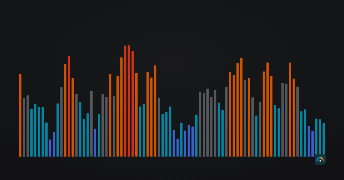
Most crypto dashboards are built to answer one question: what is the price right now? For anyone holding across a full market cycle, that is close to the least useful question available. Price alone tells you nothing about whether the market is calm or euphoric, whether leverage is piling up, or whether today’s number is unusual by the standards of the last four years.
The Hodlometer Index answers a narrower and more useful question: relative to its own recent history, how hot is this market? It is a single number between 0 and 100, published once a day for Bitcoin and Ethereum together. This article explains what goes into it, how the number is produced, and — just as important — what it cannot do.
What the index measures
Zero is the coldest reading the market has produced in the recent past: fear, forced selling, price pressed down against its long-term baseline. One hundred is the hottest: greed, crowded leverage, price stretched far above trend. Everything else sits somewhere between.
The word relative is doing most of the work in that sentence. The index does not know what a “fair” price for Bitcoin is, and it does not try to guess. It only knows where today sits inside the distribution of the last four years of readings. A Mayer Multiple of 1.1 is not intrinsically hot or cold — it is hot if the last four years have mostly been colder, and cold if they have mostly been hotter. That framing is deliberate. It keeps the index honest about the one thing it can actually observe: the market’s own recent behaviour. It is also deliberately slow — built for someone reviewing a position every few weeks, not for someone watching a chart every few minutes.
The four components
Four inputs, fixed weights, no discretionary overrides:
| Component | Weight | What it captures |
|---|---|---|
| Mayer Multiple | 30% | Price divided by its 200-day moving average — how stretched price is on a roughly seven-month horizon. |
| Distance to the 200-week MA | 30% | The same idea on a full-cycle horizon of about four years. Historically, market floors press against this line. |
| Fear & Greed, 7-day average | 25% | Sentiment, and the only component not derived from our own price data. alternative.me builds it from volatility, market momentum and volume, social media, bitcoin dominance and Google Trends, and publishes it for bitcoin only. |
| Funding rate, 7-day average | 15% | The cost of holding leveraged long positions on perpetual futures — a direct read on crowding. |
Grouped by what they actually tell you: 60% is price against its own trend, 25% is sentiment, 15% is positioning. The two price components use different windows on purpose — roughly seven months and roughly four years — so that a sharp move which is dramatic on one timescale and unremarkable on the other does not dominate the reading.
Funding rate carries the smallest weight for two reasons. It is the noisiest input, and it depends on exchange conventions rather than on the market alone. It is useful as an early warning that leverage is building, and not much more than that.
How raw numbers become a score
The four components are measured in incompatible units — a ratio, a percentage, a 0–100 sentiment score, and a fraction of a per cent per eight hours. They cannot simply be averaged. Each one is converted into a percentile rank inside its own history first.
- Window: 1,460 days. Four years, chosen because it approximates one halving cycle. Older readings drop out.
- No look-ahead. The percentile for any given date uses only data that existed on that date. A reading published in 2021 is calculated exactly as it was calculated then — the history is not quietly improved after the fact.
- Minimum sample of 365 observations. Below that, a component sits out rather than contributing a rank computed from too little data.
- Bitcoin and Ethereum blended 70/30. The three components that can be measured per asset are ranked separately for each, then combined. Bitcoin sets the cycle for both, but Ethereum gets a meaningful share rather than a token one.
- Missing inputs are handled explicitly. If a component is unavailable, the remaining weights are renormalised and the share of weight actually used is published alongside the value as
coverage. A reading based on partial data is labelled as such.
The index is computed from closed daily candles in UTC, so the published date is always the previous complete day. The full formula, including how ties are ranked, is on the methodology page.
The five zones
The 0–100 scale is divided into equal fifths. There is no clever threshold-fitting here, and that is intentional: bespoke thresholds tuned on a short history are one of the most reliable ways to fool yourself.
| Zone | Range | What it describes |
|---|---|---|
| Deep Freeze | 0–20 | Coldest fifth of the cycle: fear, deleveraging, price near its long-term baseline. |
| Cool | 20–40 | Below-average heat: interest is low, price sits under its own trend. |
| Neutral | 40–60 | Mid-range readings across the components — no strong signal either way. |
| Warm | 60–80 | Above-average heat: price is stretched over trend and leverage is building. |
| Overheated | 80–100 | Hottest fifth of the cycle: greed, crowded longs, price far above its baseline. |
What the index reads today
As of 25 July 2026 the index reads 25.3 — Cool, on full coverage, meaning all four components had enough history to participate. The breakdown:
| Component | Raw value | Score (0–100) | Weight |
|---|---|---|---|
| Mayer Multiple | BTC 0.885 · ETH 0.863 | 28.0 | 30% |
| Distance to 200-week MA | BTC +1.3% · ETH −24.8% | 17.2 | 30% |
| Fear & Greed (7d avg) | 28.7 points | 25.8 | 25% |
| Funding rate (7d avg) | BTC 0.0045% · ETH 0.0021% per 8h | 35.2 | 15% |
The lowest component score is distance to the 200-week moving average, at 17.2. That is driven mostly by Ethereum, which sits about a quarter below its own four-year baseline, while Bitcoin is roughly on top of its baseline. The highest is funding, at 35.2 — leverage is subdued, but not as unusually subdued as the price-based measures.
For context on the trend: the index read 13.6 thirty days earlier, 28.1 ninety days earlier and 79.0 a year earlier. The market has cooled substantially over twelve months. The current reading is also a recovery from the June low of 10.8 on 11 June 2026, though the coldest prints of the year so far came earlier: 8.8, reached twice in February. The index moves within a cold regime as well as between regimes.
What seven years of history look like
The index has been backfilled to 3 March 2019 — the earliest date on which all components had enough history to be ranked. That gives 2,702 daily readings through 25 July 2026, with a median of 54.0 and a mean of 52.4. The extremes so far are 1.4 on 18 June 2022 and 99.9 on 14 May 2019.
| Zone | Days | Share of history |
|---|---|---|
| Deep Freeze | 344 | 12.7% |
| Cool | 630 | 23.3% |
| Neutral | 610 | 22.6% |
| Warm | 679 | 25.1% |
| Overheated | 439 | 16.2% |
The zones are equal fifths of the scale, not of observed time, which is why the shares are uneven. Averaged by calendar year, the pattern tracks the cycle you would expect: 70.8 in 2019, 69.8 in 2020, 63.0 in 2021, then 19.1 through the 2022 drawdown, 51.2 in 2023, 61.3 in 2024, 51.6 in 2025 and 22.1 so far in 2026.
Where the index is weak
Every indicator has failure modes. These are the ones we know about.
- The sample is small. Seven and a half years spans one complete halving cycle plus parts of two others. That is enough to describe what has happened; it is nowhere near enough to establish what usually happens.
- Percentile ranking re-baselines itself. If the market moves to a permanently different regime, the index will gradually treat that new regime as normal. It measures deviation from recent history, and recent history is a moving target.
- The earliest readings rest on a shorter window. In 2019 the trailing window had cleared the 365-observation minimum but was still well short of the full 1,460 days. Treat the first year of history as directionally useful rather than precisely comparable.
- Funding rate history starts in 2019. Perpetual futures data simply does not exist for the earlier period, which is one reason it carries the smallest weight.
- It is always a day behind. Using closed daily candles avoids a value that changes under you during the day, at the cost of one day of lag.
- We do not publish forward-return statistics by zone. It would be easy to produce a table showing what Bitcoin did in the year after each zone reading. With barely more than one complete cycle of data and heavily overlapping windows, such a table would be numerically real and statistically meaningless. We would rather leave the gap visible than fill it with a spurious number.
How a holder can actually use it
As context, not as a trigger. A single number cannot know your time horizon or how much of your net worth is already in this asset class. What it can do is give you a yardstick that does not shift with the news cycle.
Three uses that hold up. As a calibration check on your own mood: if the market feels euphoric and the index reads 30, the euphoria is probably local to your timeline. As a pacing input for regular contributions — some holders lean slightly harder into cold readings, which is a scheduling decision rather than a prediction. And as a record: writing down the reading when you make a decision makes it possible, years later, to tell whether your process worked or you were simply lucky.
What it is not built for is timing to the day. Something that moves in percentile ranks over four-year windows will always report that a market was cold long before it stops being cold.
The current reading, the full component breakdown and the complete formula are documented on the methodology page, and the daily value is available as free JSON from the public API with an attribution requirement. Related calculators are in the tools section.
Frequently asked questions
What does the Hodlometer Index measure?
A single 0–100 reading of how hot the Bitcoin and Ethereum market is relative to its own last four years. Zero is the coldest end of that recent range and 100 the hottest. It is not a price forecast and not a valuation model.
How often is the index updated?
Once a day. It is calculated from closed daily candles in UTC, so the published reading always refers to the previous complete day.
Why does the index cover both Bitcoin and Ethereum?
Components that can be measured per asset are ranked separately for each and then blended 70/30 in Bitcoin’s favour. Bitcoin sets the cycle for both, but the site serves holders of both assets, so Ethereum gets a meaningful share rather than a token one.
Can the index tell me when to buy or sell?
No. It moves in percentile ranks over four-year windows, so it will always report that a market was cold long before it stops being cold, and hot long before it stops being hot. It is designed as context for a slow decision, not as a trigger.
Is the index history recalculated when new data arrives?
No. Every reading uses only the data that existed on its own date, so published historical values do not change retroactively.
Can I use the index data in my own project?
Yes. The daily value is published as free JSON, including for commercial use, with a requirement to credit the Hodlometer Index with a visible link.